Objectives
- Brand identity development and logo design
- Colour palette and typography system
- Website design and user experience
- Marketing collateral and brand guidelines
- Complete within 3 weeks
Role
Freelance
Strategy
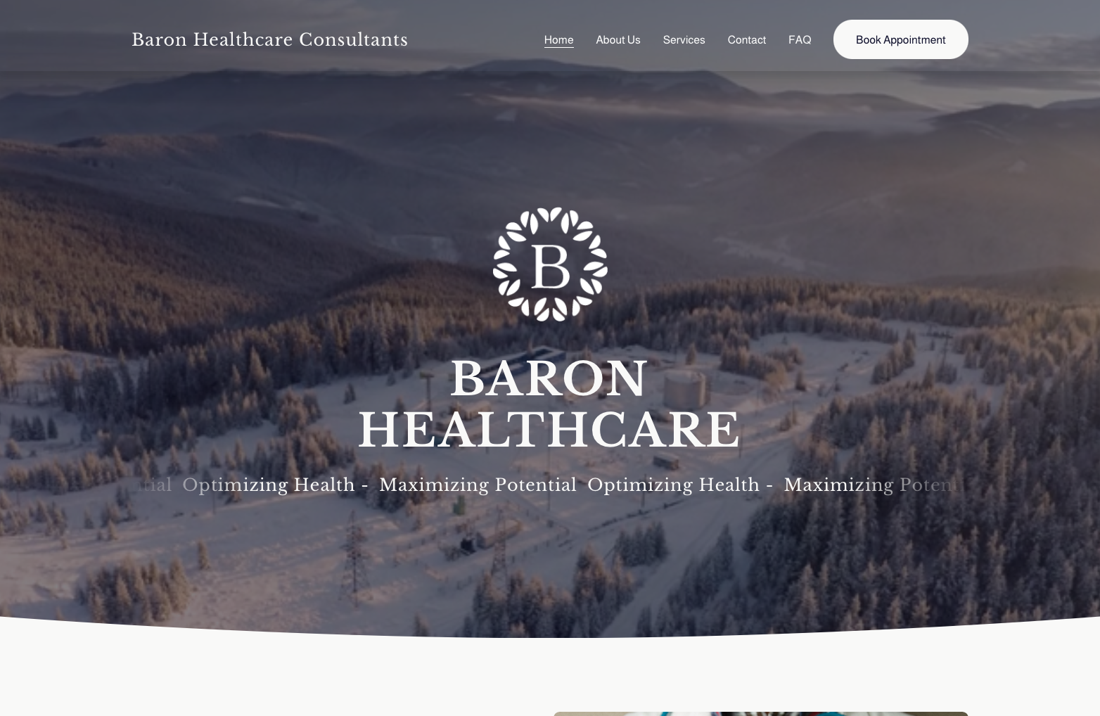
Because I was on a tight deadline, the process was pretty condensed. I spent about a week going back and forth with the client on the logo, putting together rough drafts just to get a feel for what they liked. They ended up choosing a serif “B” surrounded by a pattern. The serif font was a nice way to show professionalism, which was important to the client as a healthcare company, while the abstract pattern added some flair and made it more recognizable. We kept in mind that the logo should look great on all kinds of things, from a hat to a coffee mug and the pattern helped create brand recognition.
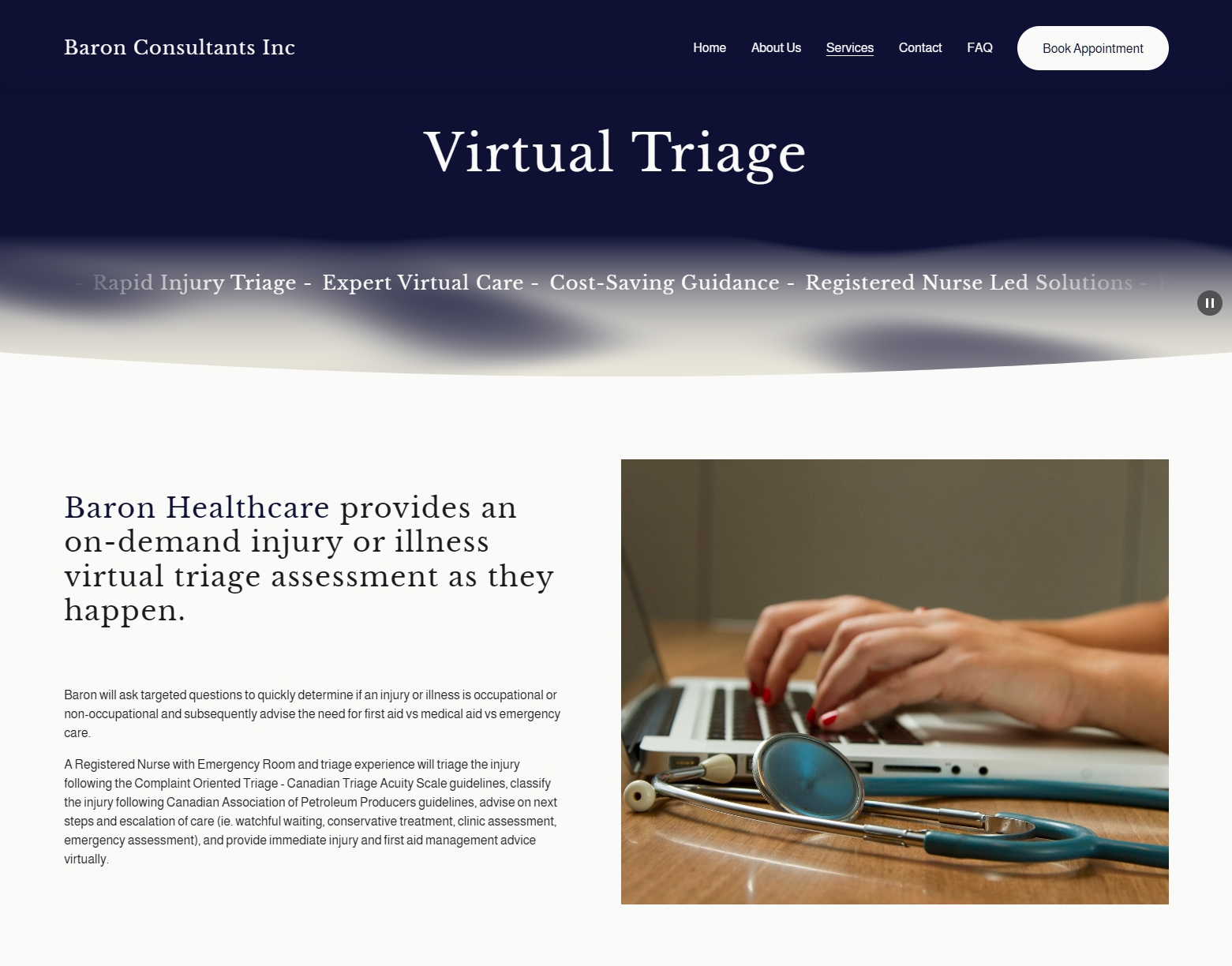
The website was finished in two weeks using Squarespace. Although it wasn’t my first choice of platform, the client was comfortable with it and wanted to be able to take control once the site was finished. I hadn’t used Squarespace much before, so I was learning as I went. It was a bit limiting at times, but I was able to solve most issues by using the code injector tool.
I was given all the content and pages that needed to be on the site. From there, I mapped out the design for each page, focusing on making it visually impactful while keeping it clean and simple. Some of the information was pretty dense, so I broke it up into bite-sized sections with drop-down menus, bold headings, and photos. That way, everything felt a bit more approachable and easier to navigate. In the end, I achieved my goals with the site. The pages are short and to the point, without overwhelming the visitor. The clean, easy-to-follow design uses visual hierarchy and contrast to guide you smoothly from one section to the next. Animations and small details help bring it all together, adding a premium feel to the overall experience.